Editorial layout blocks for Payload CMS
Long-form pages need structure, such as a reading column beside a rail, a side-by-side comparison or a key-facts sidebar. Tome has seven editorial layout blocks for that, including Editorial Spread and Info Panel; none is free, and they install into the Payload project you already have.
Add one to your Payload project
You need a Payload 3 and Next.js app, a free account and an install token. The get-started guide covers the token and the .npmrc lines.
Editorial Spread is in the paid Editorial Pack pack, so your token needs to cover it. The steps are the same as for a free pack.
Install the pack
npm install @wabbit/tome-blocks-editorial-packLoad the design tokens
One line in your global CSS. Without it the blocks render unstyled.
@import '@wabbit/tome-blocks-core/styles.css';Add the block to a field
Put it in your Pages collection's blocks field, next to the blocks you already have. Run
payload generate:typesafterwards so your generated types know about the new block.import { editorialSpreadBlock } from '@wabbit/tome-blocks-editorial-pack' // in your Pages collection: { name: 'layout', type: 'blocks', blocks: [...existingBlocks, editorialSpreadBlock.block()], }Render it on the Tome grid
import { renderers } from '@wabbit/tome-blocks-editorial-pack/render/register'
import { adaptRenderersForPayload, RenderBlocks } from '@wabbit/tome-blocks-core/render'
import gridStyles from '@wabbit/tome-ui/grid'

const blockComponents = {
  ...yourExistingComponents,
  ...adaptRenderersForPayload(renderers),
}

<RenderBlocks
  blocks={page.layout}
  components={blockComponents}
  gridClassName={gridStyles.grid}
/>
Only if the project has never installed from our registry
Sign up at /signup (no card). Then go to Account, Credentials, claim the free license and generate your key in the same card. Add this to the project's .npmrc:
@wabbit:registry=https://npm.wabbit.com/And this to your user-level ~/.npmrc:
//npm.wabbit.com/:_authToken=YOUR_TOKEN_HEREQuestions about editorial layout blocks
- What is the difference between Editorial Spread and Editorial Section?
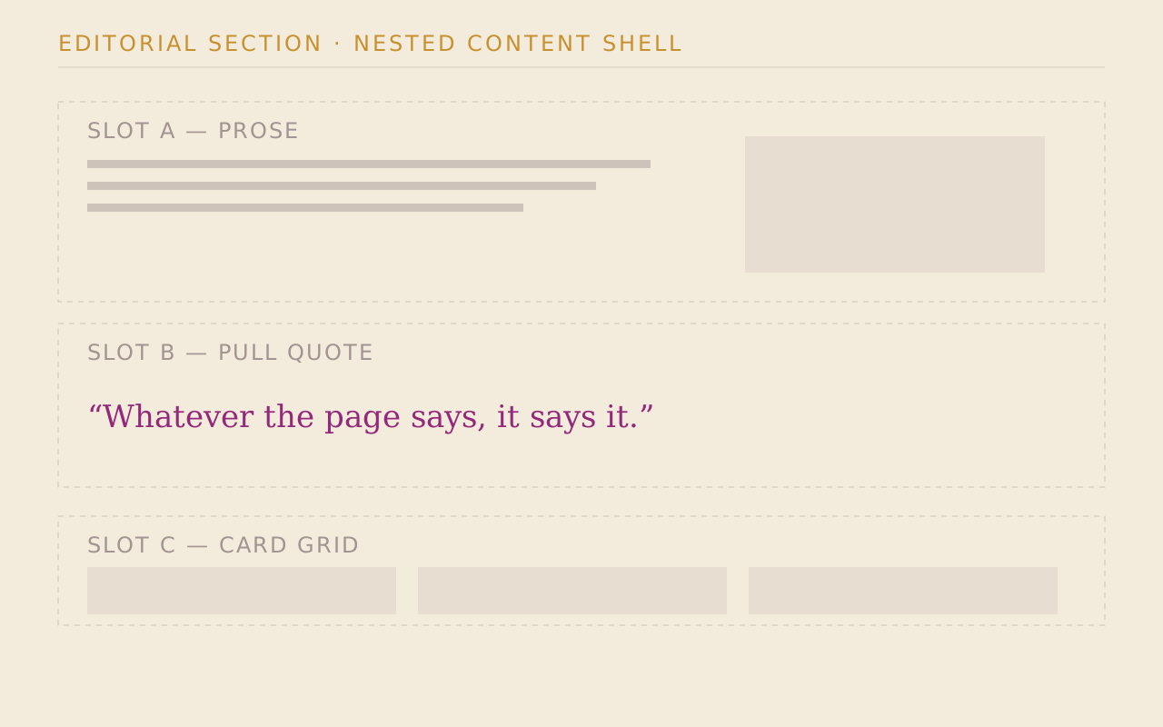
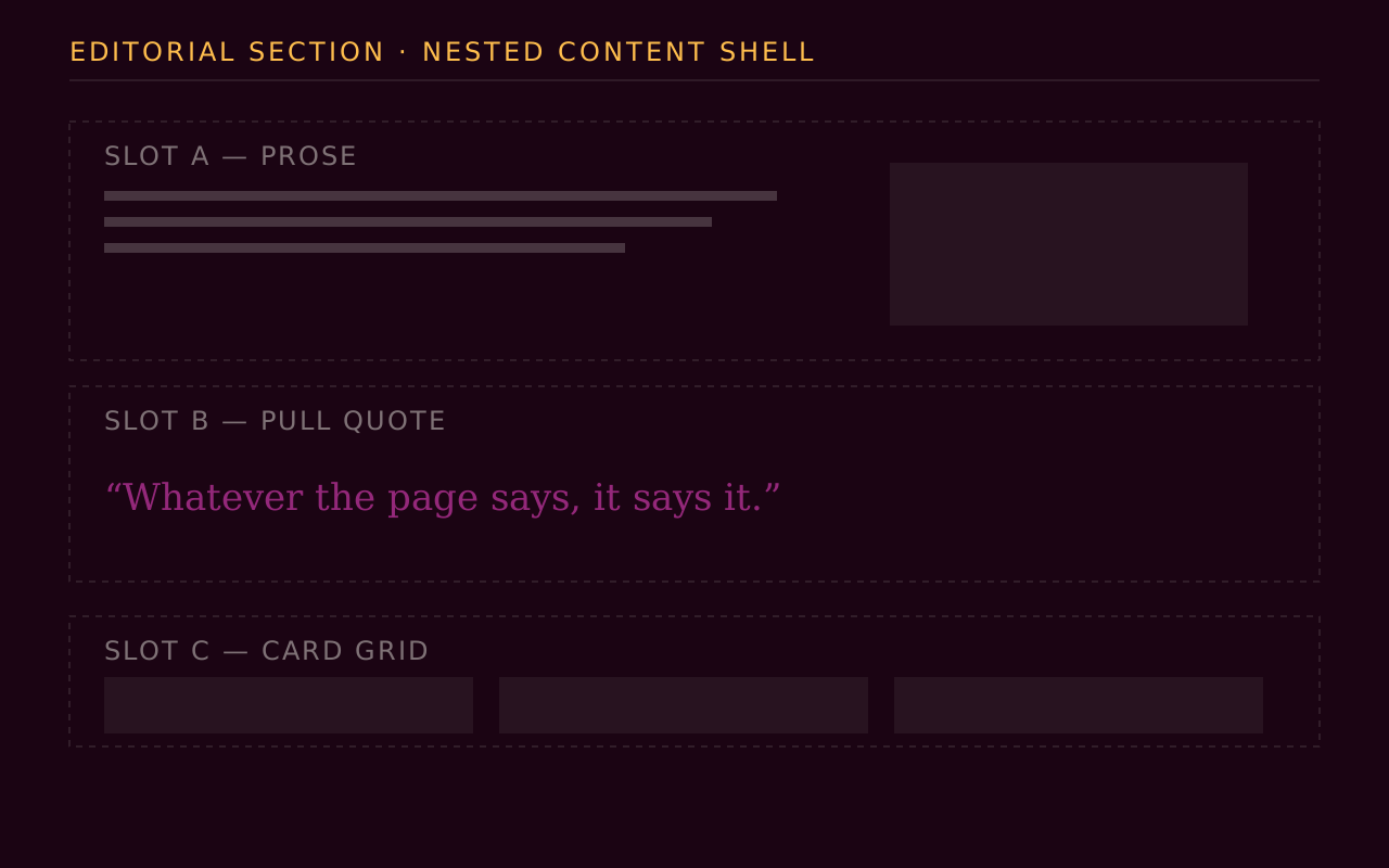
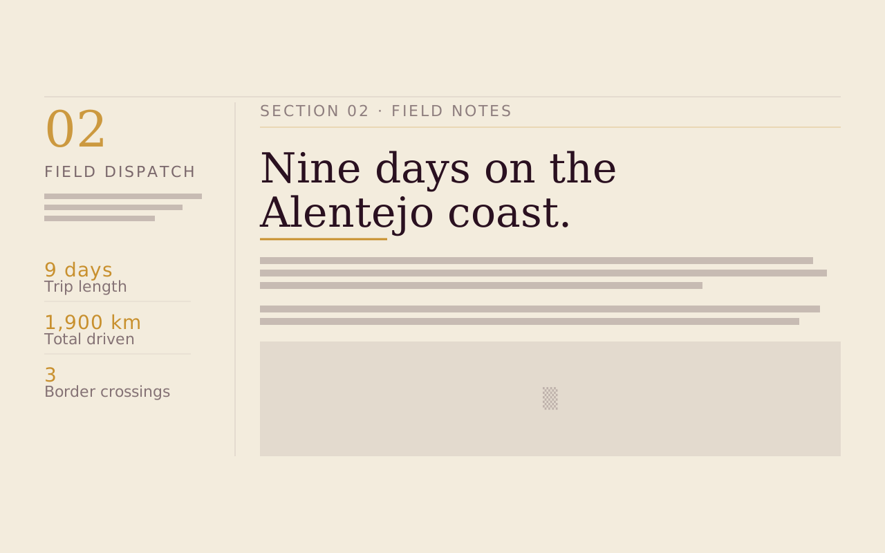
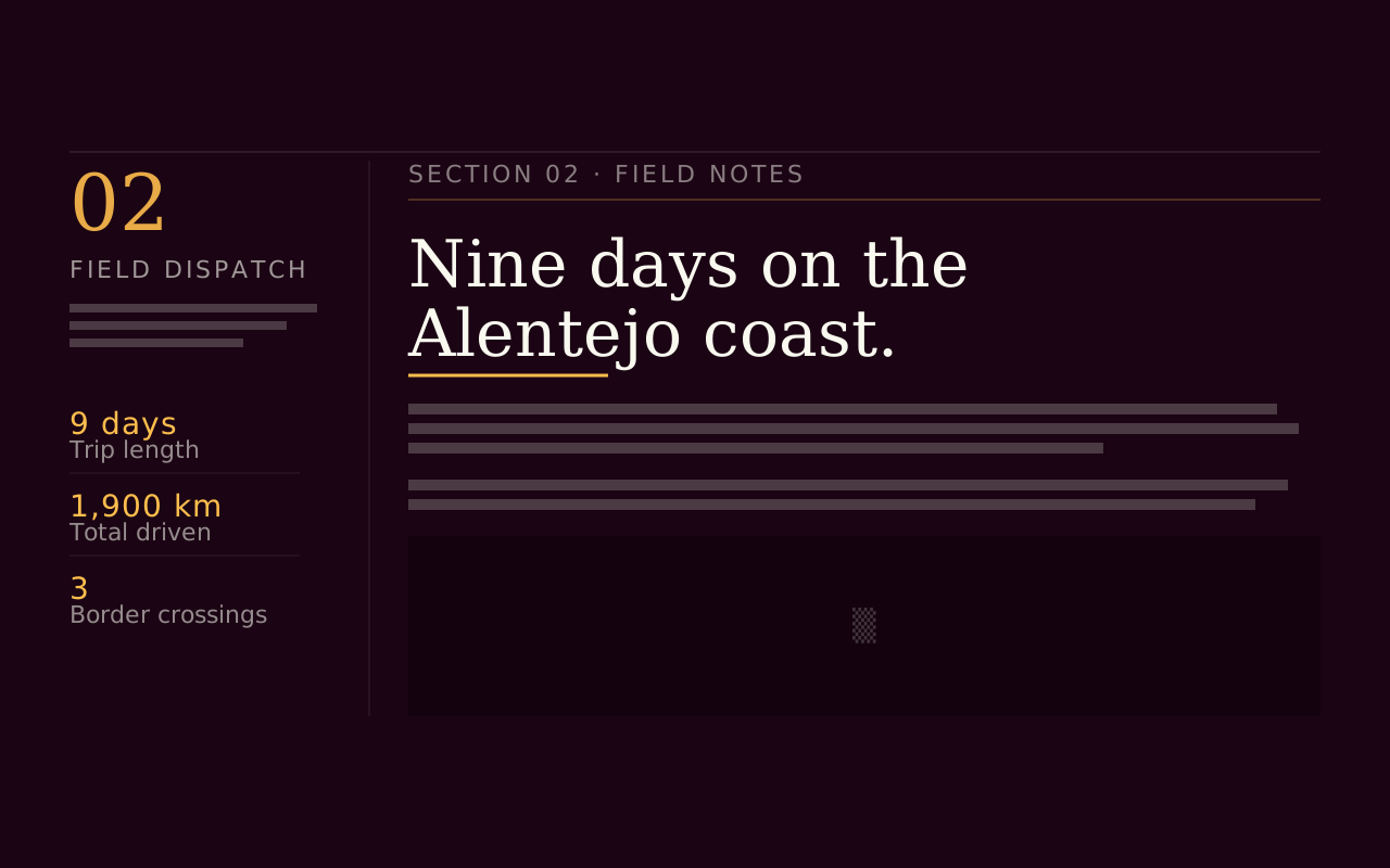
- Editorial Spread is a full-bleed band that pairs a narrow rail (kicker, index, footnotes, stats) with a main reading column. Editorial Section is its lighter sibling, a banded section with a reading column and no rail, for prose that doesn't need marginalia.
- Can I compare two options side by side?
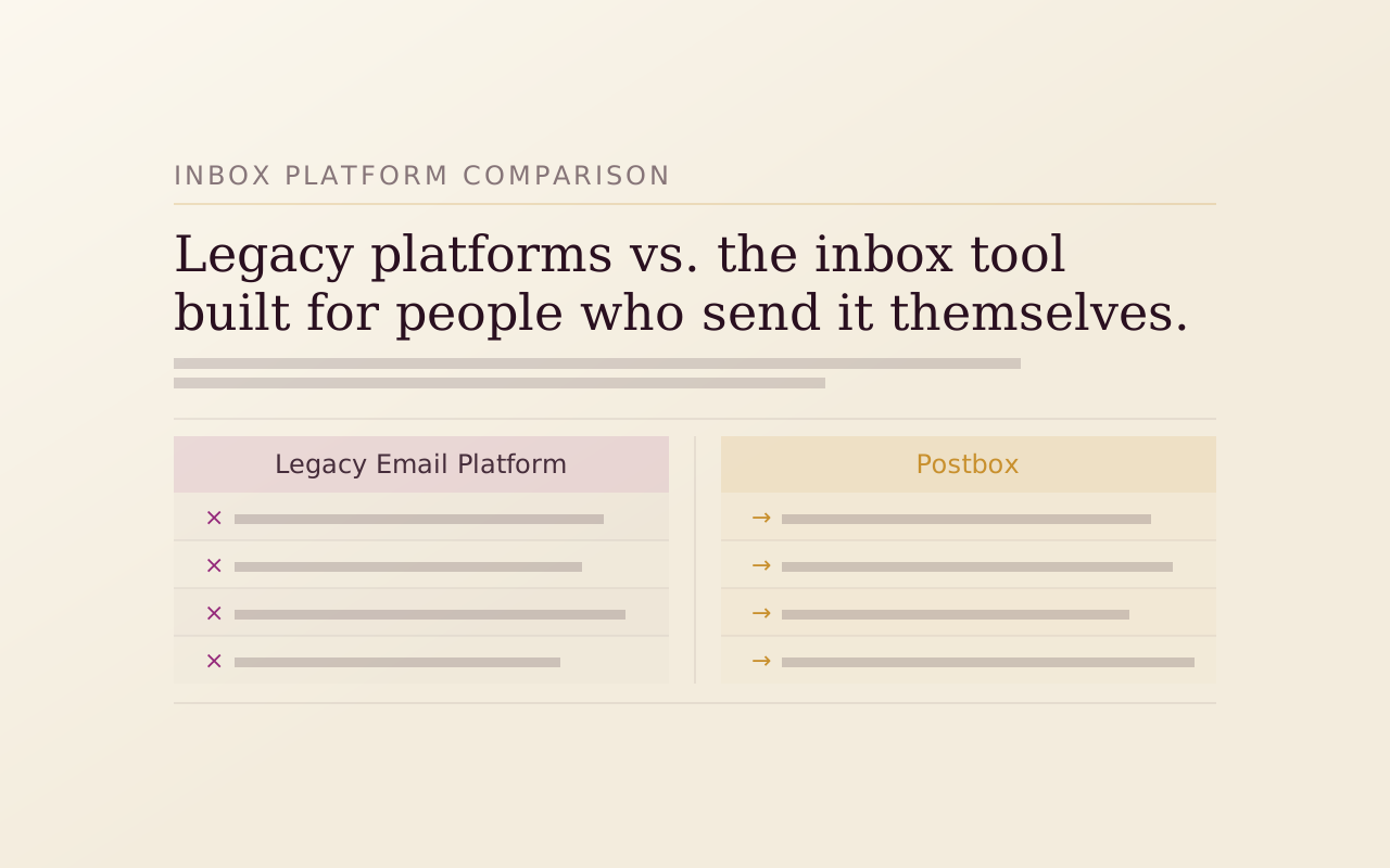
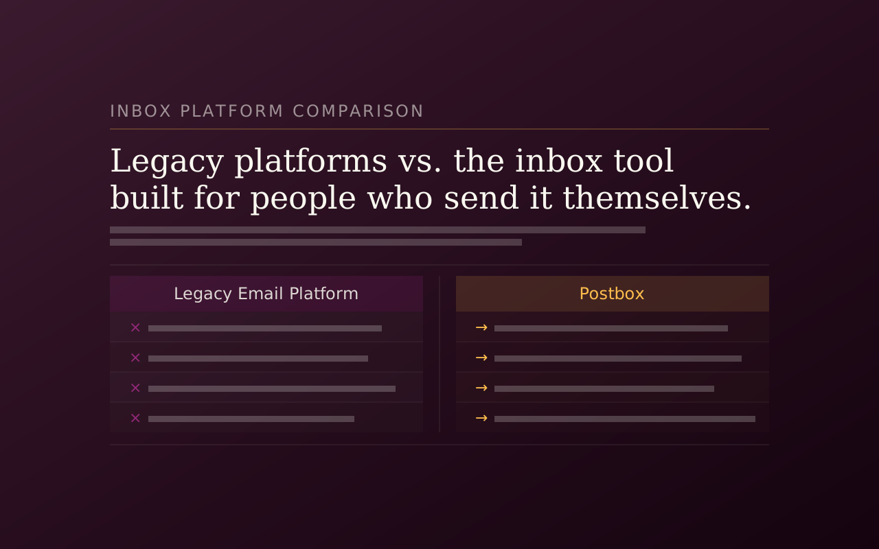
- Compare Columns is a strict two-column A versus B layout. Each column has a label, a sense (positive, negative or neutral) and a list of line items, and the positive column gets an accent treatment while the negative one is muted.
- How do I put key facts beside the text?
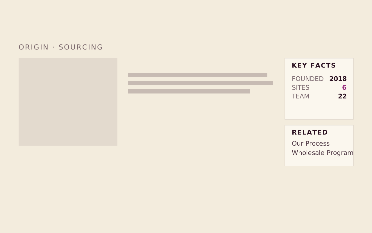
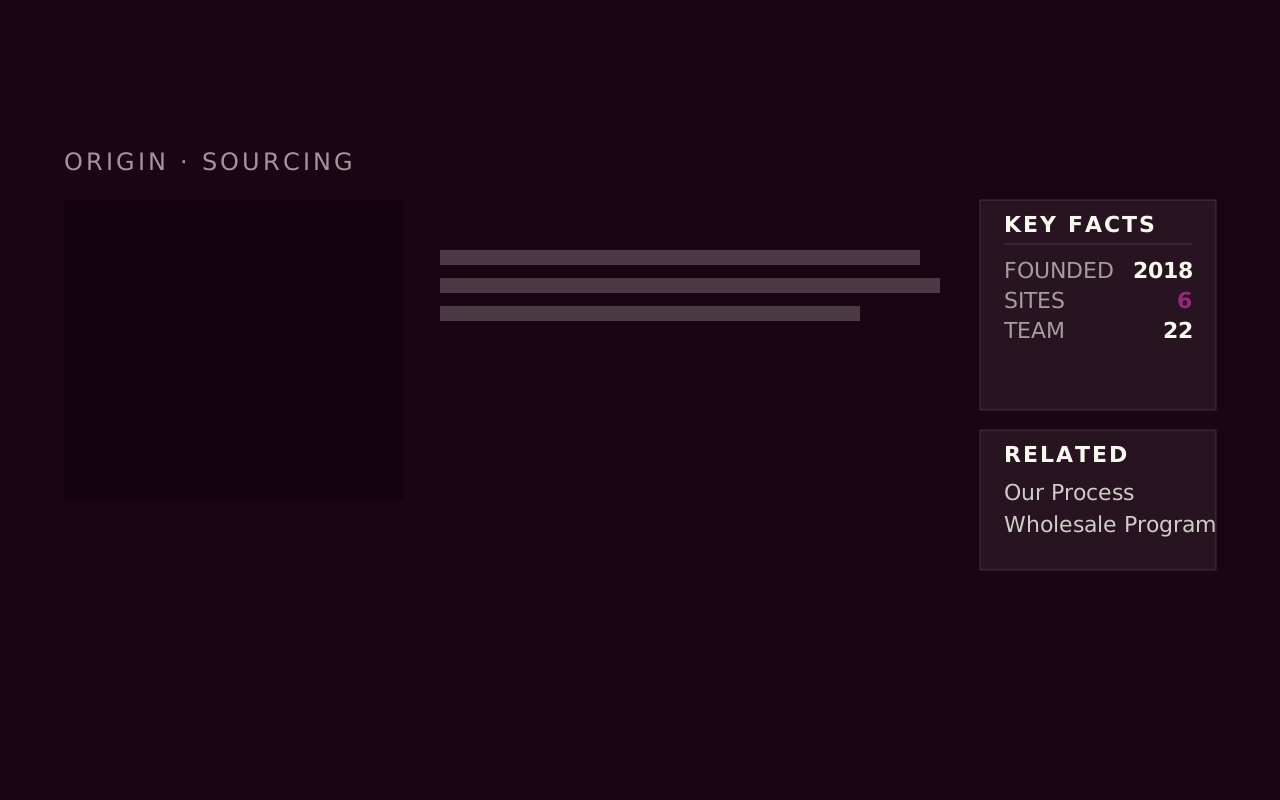
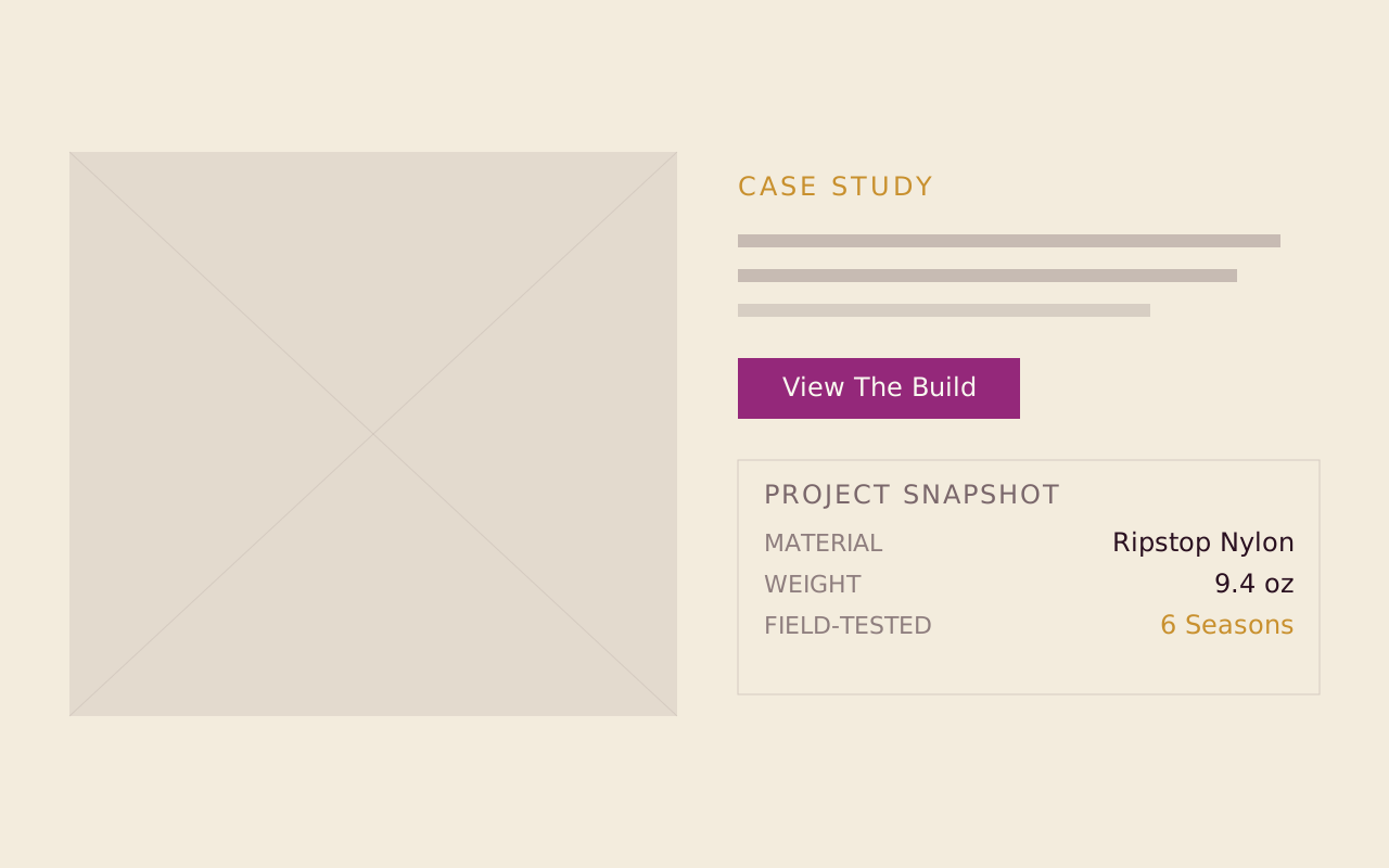
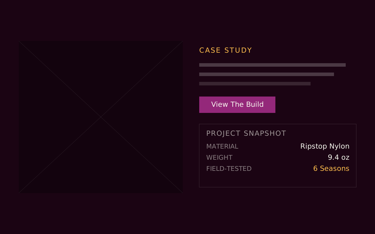
- Info Panel pairs rich-text prose with a sidebar of label and value pairs, with optional status colors and a list of related links. The sidebar can stick to the viewport while the prose scrolls. Split Panel is a 50/50 image and text split with an optional collapsible data panel.
- Is there a callout with a priority level?
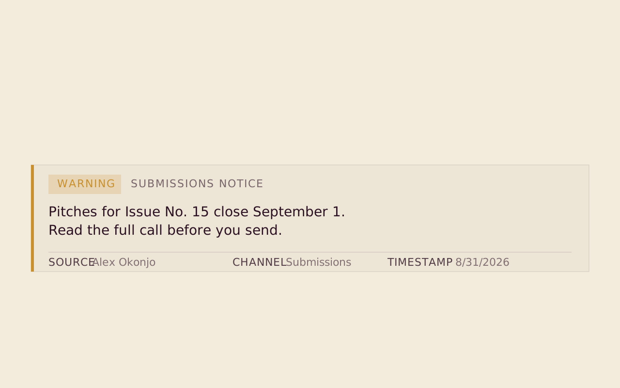
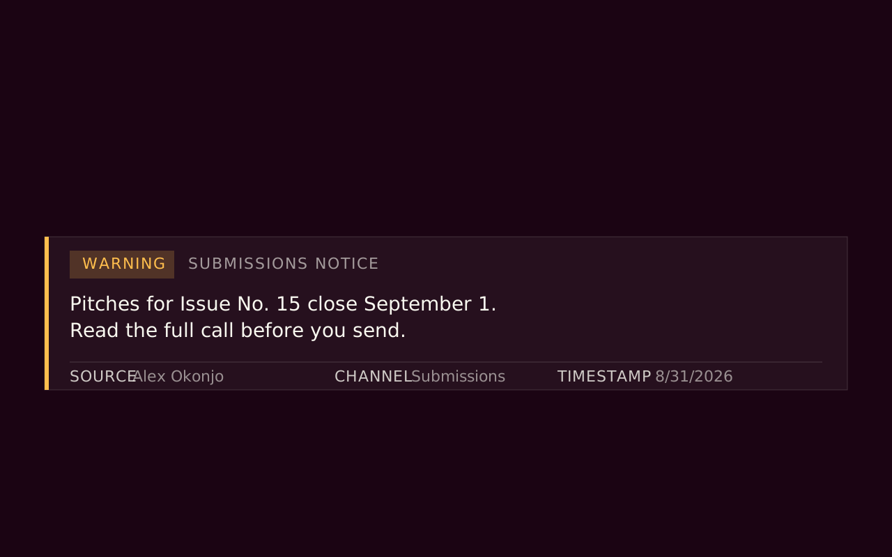
- Message Panel shows a single message at Info, Warning or Urgent priority, with optional source attribution, a category label, a timestamp and an image. It has two modes, a left-border accent for inline use and a full tinted background for stronger interruption.
Start with the free packs.
Create a free account, generate an install token, and add a pack to the Payload project you already have. There is no card and no trial.
The Craft Library is $250 a year and adds every paid pack with full source. If you stop, what you installed stays yours.
- Free: Marketing Starter and Content Writer, 19 blocks, no card.
- Craft Library, $250 a year: every paid pack and theme, full source, scoped install tokens.
- Single packs, $49 once: for the packs sold on their own.