Layout and structure blocks for Payload CMS
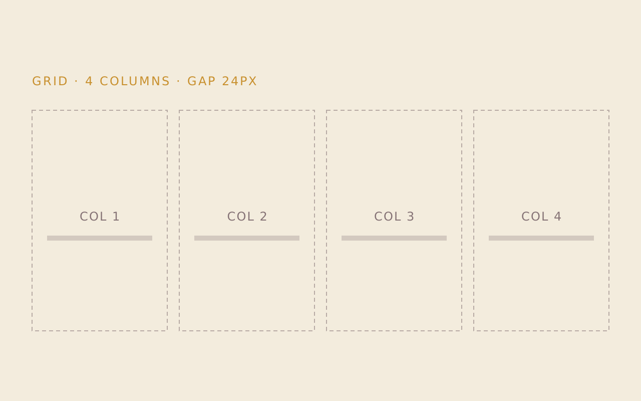
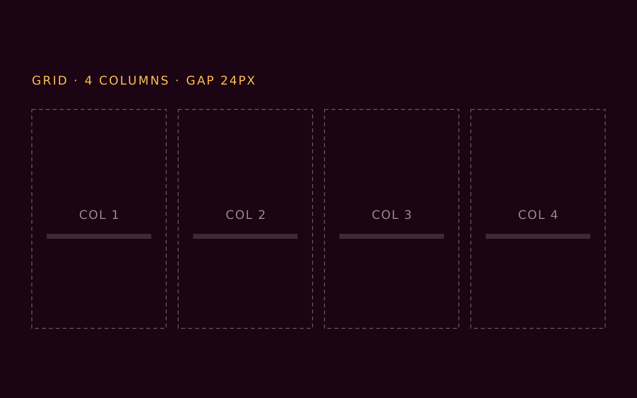
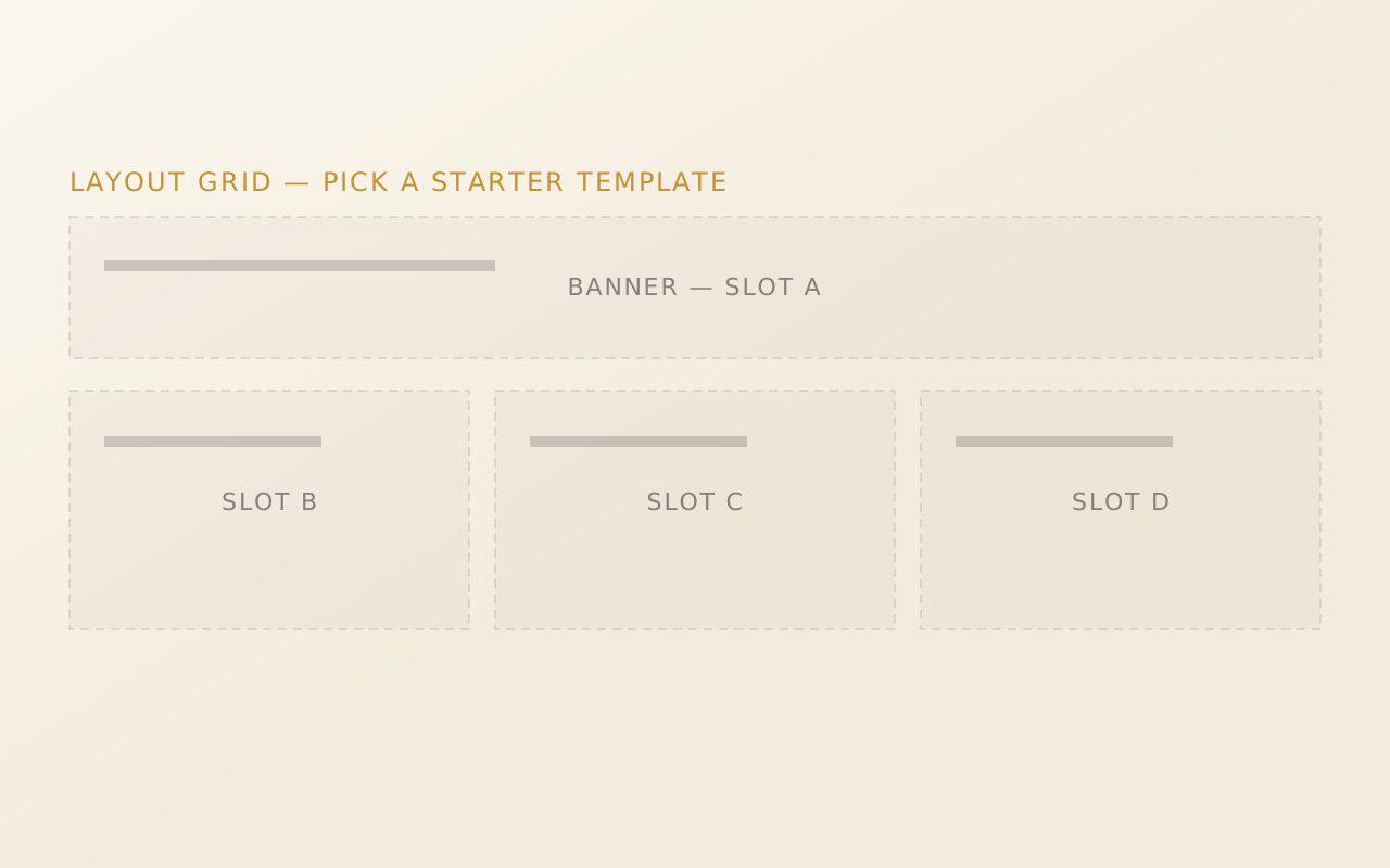
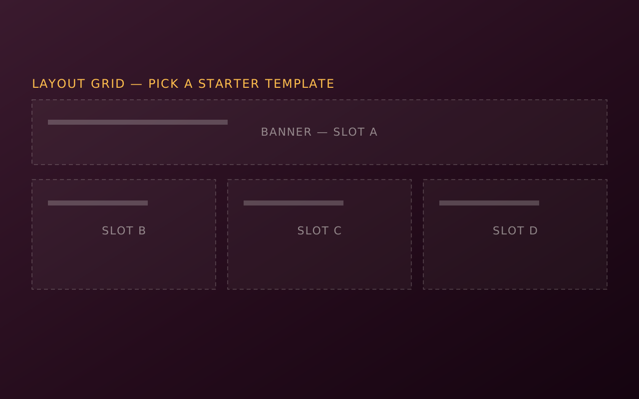
Layout blocks set the bands, columns and grids that other blocks sit in. Tome has 12, from Section, Grid and Layout Grid to Content Two Column and Stacking Wrapper, none of them free, and they install into the Payload project you already have.
Add one to your Payload project
You need a Payload 3 and Next.js app, a free account and an install token. The get-started guide covers the token and the .npmrc lines.
Section is in the paid Extras pack, so your token needs to cover it. The steps are the same as for a free pack.
Install the pack
npm install @wabbit/tome-blocks-extrasLoad the design tokens
One line in your global CSS. Without it the blocks render unstyled.
@import '@wabbit/tome-blocks-core/styles.css';Add the block to a field
Put it in your Pages collection's blocks field, next to the blocks you already have. Run
payload generate:typesafterwards so your generated types know about the new block.import { sectionBlock } from '@wabbit/tome-blocks-extras' // in your Pages collection: { name: 'layout', type: 'blocks', blocks: [...existingBlocks, sectionBlock.block()], }Render it on the Tome grid
import { renderers } from '@wabbit/tome-blocks-extras/render/register'
import { adaptRenderersForPayload, RenderBlocks } from '@wabbit/tome-blocks-core/render'
import gridStyles from '@wabbit/tome-ui/grid'

const blockComponents = {
  ...yourExistingComponents,
  ...adaptRenderersForPayload(renderers),
}

<RenderBlocks
  blocks={page.layout}
  components={blockComponents}
  gridClassName={gridStyles.grid}
/>
Only if the project has never installed from our registry
Sign up at /signup (no card). Then go to Account, Credentials, claim the free license and generate your key in the same card. Add this to the project's .npmrc:
@wabbit:registry=https://npm.wabbit.com/And this to your user-level ~/.npmrc:
//npm.wabbit.com/:_authToken=YOUR_TOKEN_HEREQuestions about layout and structure blocks
- What does the Section block do?
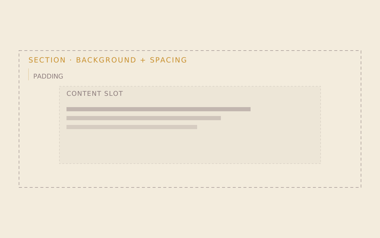
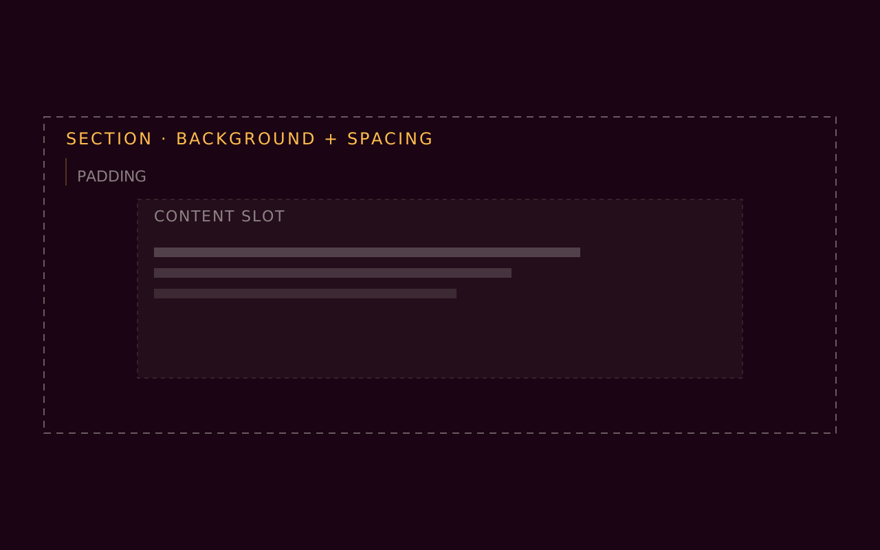
- Section is a full-width container with a background color, top and bottom padding and a max-width. You wrap related blocks in one to give them a shared surface, rhythm and reading width.
- What is the difference between Grid and Layout Grid?
- Grid is an equal-column CSS grid, with a fixed column count of 1, 2, 3, 4 or 6 and a gap. Layout Grid starts from a curated template, such as a two-up with an image or a feature with a sidebar, and lets an editor drop existing blocks into the cells and adjust each child's span.
- Can sections stack as the reader scrolls?
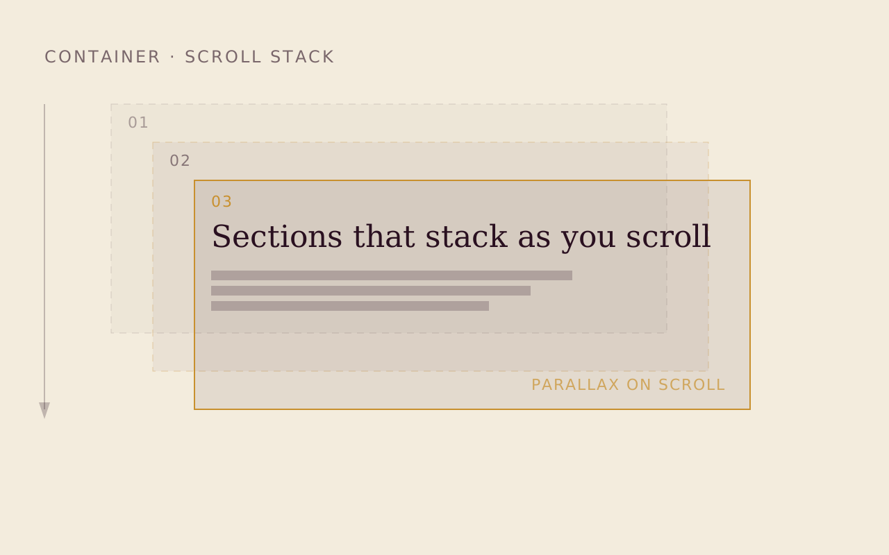
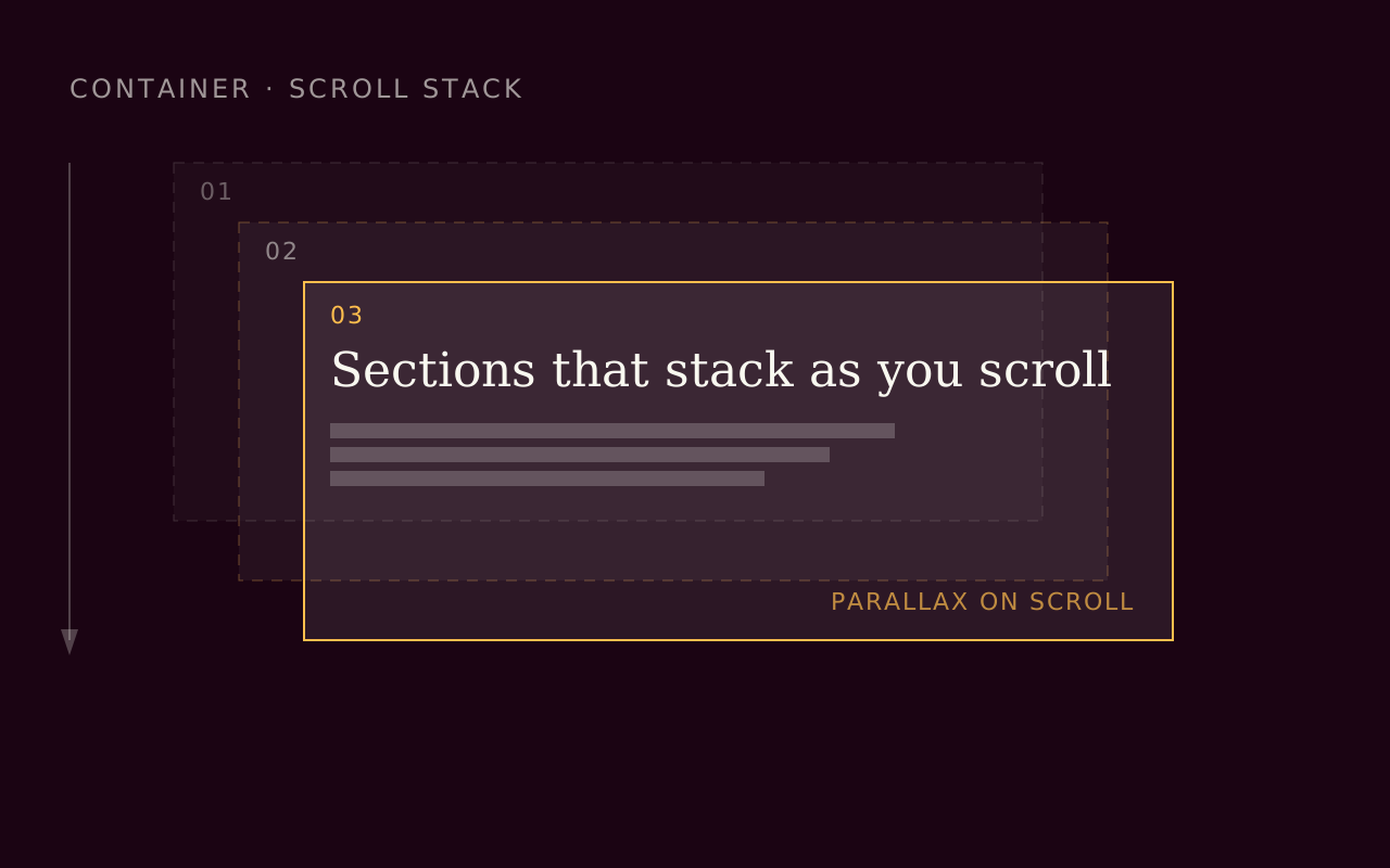
- Stacking Wrapper pins its child sections and stacks them like overlapping cards as the reader scrolls, with optional parallax, fade and scale.
- Is there a text-beside-image block?
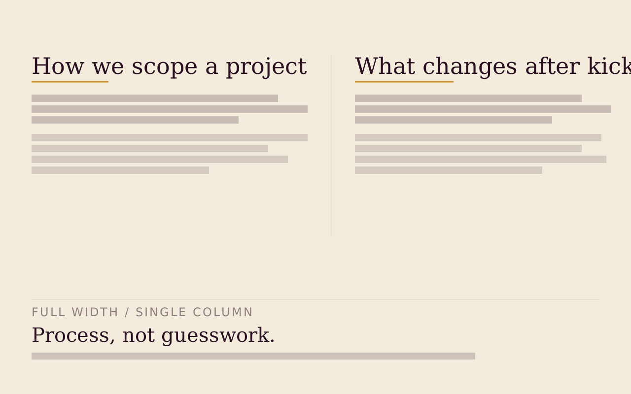
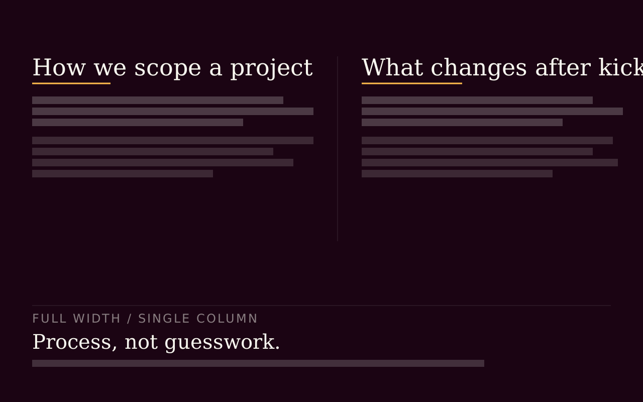
- Content Two Column is a fixed left and right split, and each column holds either rich text or a media upload with a caption. Content is the flexible alternative, an array of rich-text columns sized against a 14-track grid.
Start with the free packs.
Create a free account, generate an install token, and add a pack to the Payload project you already have. There is no card and no trial.
The Craft Library is $250 a year and adds every paid pack with full source. If you stop, what you installed stays yours.
- Free: Marketing Starter and Content Writer, 19 blocks, no card.
- Craft Library, $250 a year: every paid pack and theme, full source, scoped install tokens.
- Single packs, $49 once: for the packs sold on their own.